7 Surprising Facts About Online Forms You Probably Didn’t Know

Online forms are everywhere. From newsletter signups to customer feedback, they quietly power much of the web. But behind their simplicity lies some pretty interesting facts you may not know.
At Yupform, we’ve helped businesses build thousands of forms—and we’ve learned a lot along the way. So today, we’re pulling back the curtain on the humble online form.
Here are seven surprising facts about forms that might just change how you think about them.
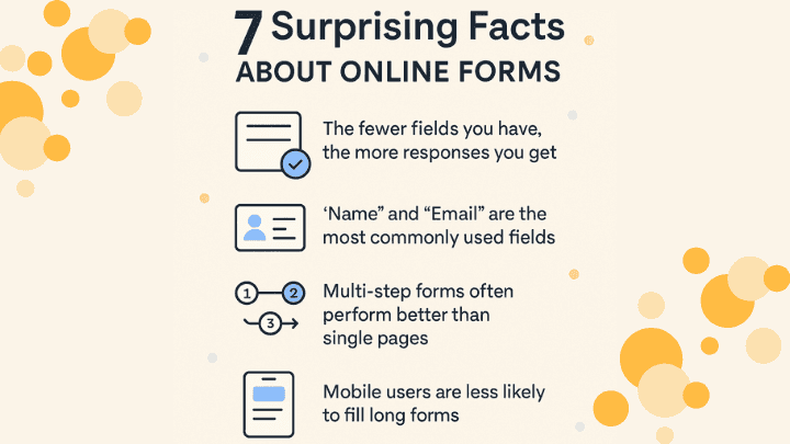
1. The Fewer Fields You Have, the More Responses You Get
This one might seem obvious, but the numbers back it up. According to multiple studies, reducing form fields from 11 to 4 can increase conversions by up to 120%.
People are more likely to fill out your form when it feels quick and easy. For example, instead of asking for full address details on a lead form, you can just ask for name and email—and follow up later.
Yupform Tip: Our builder makes it easy to create short, focused forms with conditional logic so you only ask what’s necessary.
2. “Name” and “Email” Are the Most Commonly Used Fields
Out of all the forms created globally, over 90% include just two fields: name and email. Whether it’s a contact form, a signup form, or a survey, those two inputs form the foundation of most interactions.
It goes to show: sometimes, simple really is effective.
3. Multi-Step Forms Often Perform Better Than Single Pages
When users see too many fields at once, it can feel overwhelming. That’s why breaking long forms into smaller steps—like a wizard-style interface—can improve completion rates by up to 30%.
Think of it as guiding users through a conversation, instead of asking for everything at once.
Example: Instead of asking name, email, phone number, company name, and message on one screen, try collecting them step-by-step. Yupform’s multi-step form layout helps you do exactly that.
4. Mobile Users Are Less Likely to Fill Long Forms
Over 60% of form submissions come from mobile devices. But here’s the twist—mobile users are more sensitive to friction. Even an extra field or slow-loading form can cause them to bounce.
If your form isn’t optimized for mobile, you’re losing out.
Yupform Tip: All Yupform forms are fully responsive and optimized for fast mobile experience out of the box.
5. Auto-Fill Can Boost Form Completion Rates
Browsers and devices now support autofill for fields like name, email, phone, and address. When your form is properly structured and labeled, autofill can make the process faster and less frustrating—leading to higher conversions.
Pro Tip: Always use proper field labels and HTML attributes. Yupform handles this automatically so your forms play nicely with autofill.
6. Clear Call-to-Action Buttons Matter More Than You Think
The words on your submit button matter. In one case study, changing “Submit” to “Get My Free Ebook” improved conversions by 17%. Clear, benefit-focused text helps users understand what they’re getting.
Try This: Instead of “Submit,” use “Book My Call” or “Join the Waitlist” depending on your goal.
7. You Can Collect More Than Just Text
Forms today aren’t limited to plain input. You can collect files, images, star ratings, dates, even signatures—all from the same form. This opens the door to more creative use cases like:
And Yupform supports all of it—without any coding.
Final Thoughts
Forms may seem simple, but they hold the power to connect, convert, and collect valuable insights. By understanding how people interact with forms and making small improvements, you can turn even a basic form into a powerful experience.
Looking to create a better form experience for your users?
Try Yupform for free and build smarter, faster, and more effective forms—today.